What are some of my favorite colors? old forge mustard, navy, barn red, buttermilk, soldier blue, pumpkin, cranberry, black, and hunter green. Recently I read a post questioning why anyone ever liked that "ugly" green color..it made me giggle!
Here's some snapshots of one of my favorite places to shop...filled to the brim with prim
(or high country as they call it).
I love warm, rich colors, like the barn red dry sink I found for next to nothing, the navy blue pie safe that holds flour & sugar, the little chippy red milk stool, and yes, even the hunter green stand that holds my tabletop loom...old items I've been lucky enough to find, some in their original paint colors, reminding me of times past. And living in a farmhouse built 155 years ago makes items like these all the more meaningful to me.
Am I behind the times or not keeping up with the latest trends? Perhaps. But for me, the monochromatic colors I see in so many magazines and homes just feel cold. When I come through the door, I want everything to feel warm, welcoming, and comfortable.
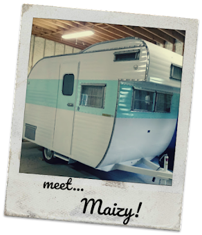
Color trends come and go...our little 1963 camper is filled with cherry red and turquoise which is just right for a vintage camper,

and I just spied this pink 1962 kitchen! In the right space, this is a time capsule I can absolutely appreciate.
Look at this stove!
Regardless of what colors we like or don't like; here's the thing - don't fall for the picture-perfect homes in magazines or blogs that are staged for beauty; not filled with things that are truly valuable...
family photos, crayon drawings, well-loved books, and items handmade and handed down.
A design degree taught me all about French, modern, English, high country, Scandinavian, and minimalist designs, but what matters in the end?
Fill your home with what you love best!
What makes you smile?
What makes you happy?
What brings back memories?
Those are the homes we want to live in and where sweet new memories are made.